
Buttons can link to a step within your funnel, to any URL, or to scroll to an anchor tag on the same page. They can also be used to submit a form or to trigger a Popup (if either one exists in that section).
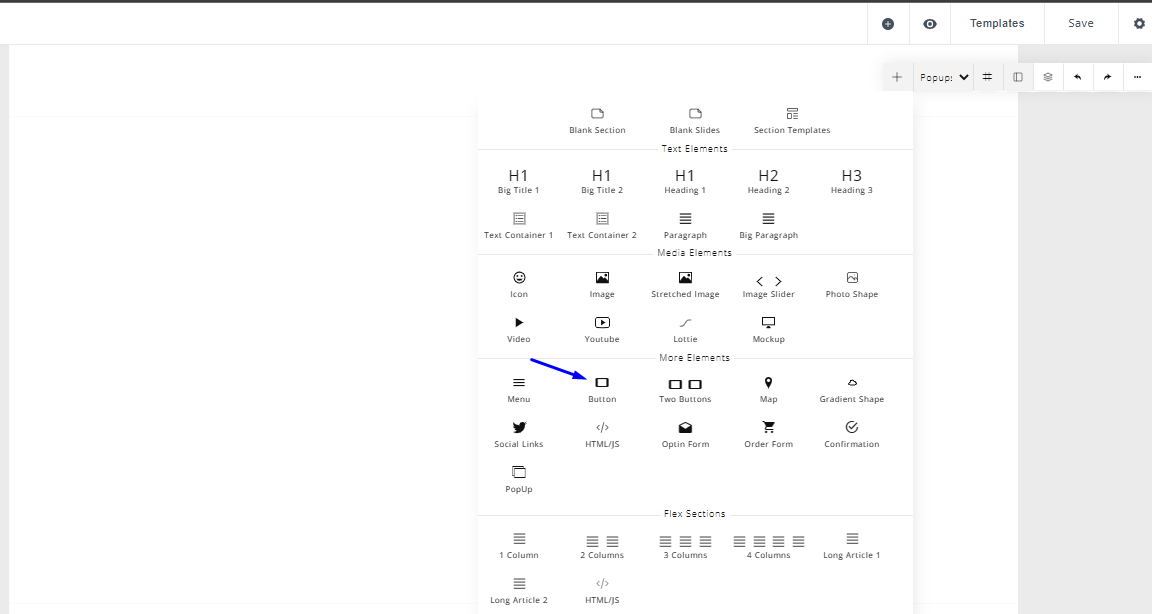
- To pull in a Button element, click the plus "+" icon at the top right of the builder and select “Button”.
- To pull in two side-by-side buttons, click the plus "+" icon at the top right of the builder and select “Two Buttons”.
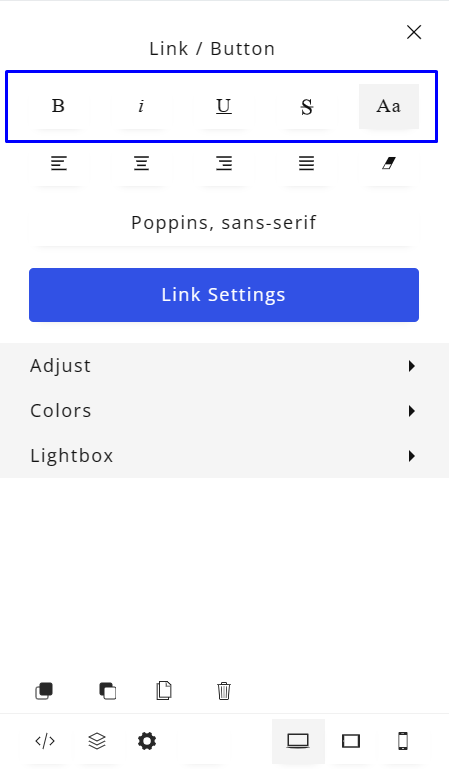
- You can bold, italicize, underline, strike-through, or uppercase/lowercase text within the button via the left side panel.
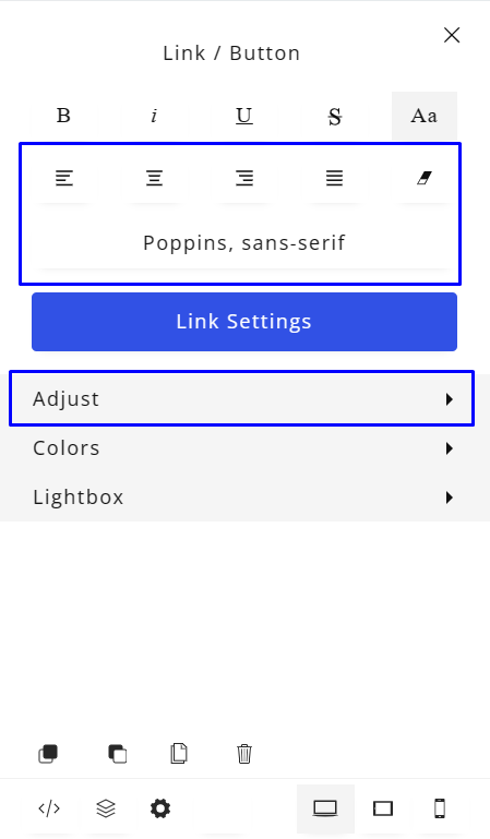
- You can also justify the button (left, center, right, or full). In the Adjust tab, you can change the button size, margins and padding, set the border width and radius, set whether the button width is automatic or 100% of the block width, set the Font size, font weight, Letter Spacing and Line Spacing
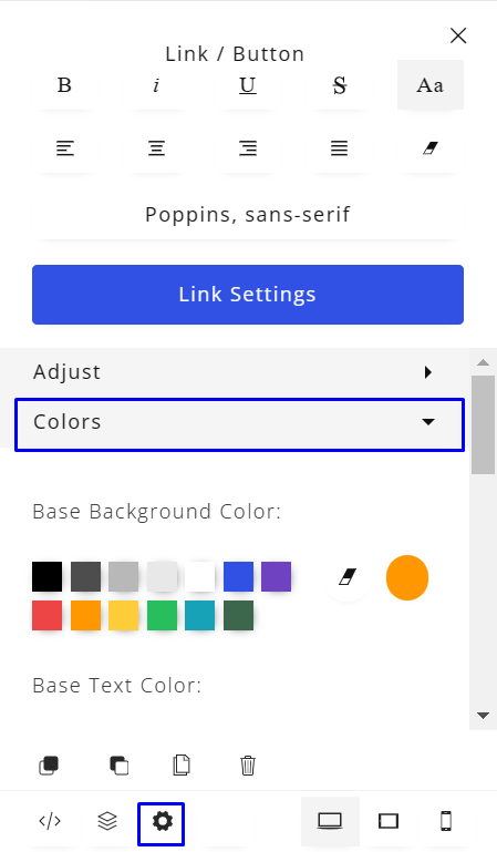
- To edit the colors of the button and the button text, as well as the hover effects for the actively selected button, select the button and click the settings icon under the button. This will bring up Button Settings within the left side panel. Expand the “Colors” section, here, you can set a base color for the button background, button text, button border and all the same for the 'on hover' button state.
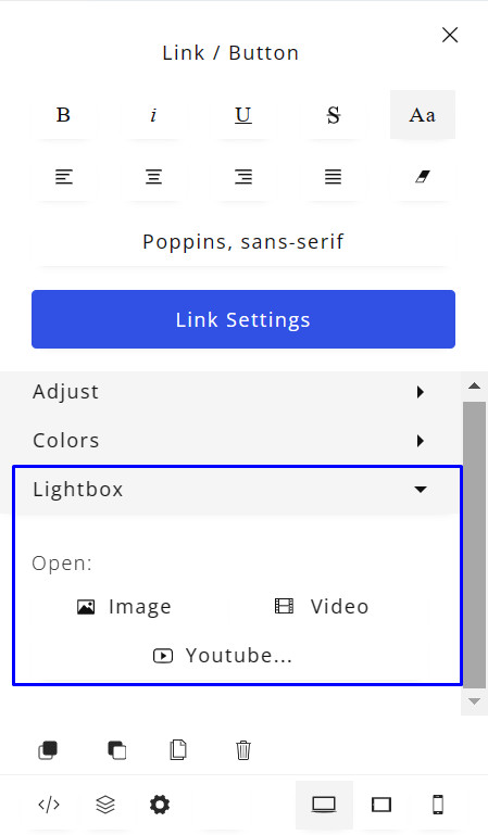
- In the Light box tab, you can open an image or video (Including a YouTube link) when a visitor clicks on the button.
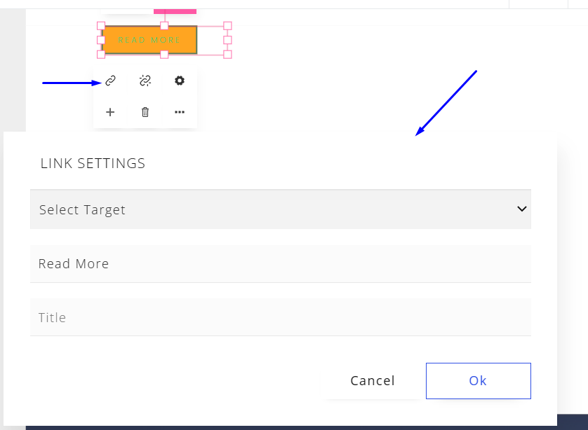
- Finally, if you want to add a custom link to the button, you can select the button element, and then you will see the link icon together with other icons specific to the button element.
- Select the link icon and the “LINK SETTINGS” module will pop up. Click on the “Select Target” dropdown and you can select the option you prefer.